
Abstract
Problem Space
In the rapidly evolving Iranian e-commerce ecosystem, both our client recognized a unique opportunity to address the growing demand for a user-centric digital wallet solution. Extensive research revealed a clear gap in the market, with existing payment apps failing to meet the needs of the target audience – professionals, tech enthusiasts, millennials, and Gen Z. A lack of simplicity, trustworthiness, and emotional appeal in government-based apps left potential users seeking a modern, efficient, and delightful digital wallet. With a keen understanding of the context and opportunities in this market, we embarked on a mission to create an innovative and responsive platform that would revolutionize the way users manage their finances, making everyday transactions seamless and enjoyable. Understanding the significance of seamless experiences, we prioritized elements that championed simplicity and speed, making nPay a highly accessible and efficient digital wallet.
Solution Space
“Ease” emerged as a design principle. Leveraging our design expertise, we crafted a dynamic visual identity that embodies emotions, authenticity, and technological advancement. The lowercase ‘n’ in the logo symbolizes seamless transactions, and our geometric, monoline structure lends a modern and tech-savvy feel. The vibrant color palette, inspired by the earth’s atmosphere, adds a touch of excitement and relevance. The bottom-sheet design in our user interface allows for smooth navigation and an engaging user experience. Our design system, based on Material Design 2, ensures consistency and scalability across all components, while our typography choices of Roboto and Yakan Bakh strike a perfect balance of simplicity and functionality. With a focus on ease, efficiency, and trust, nPay aims to revolutionize the digital wallet landscape in Iran and cater to a wide range of users, providing a reliable, user-friendly, and delightful platform for all their financial needs.
My Roles: As the designer and strategist, my role encompassed developing the overall strategy for nPay. I led the research efforts and collaborated on brand identity and UI design, actively participating in ideation and graphic design. Additionally, I created prototypes and conducted rigorous testing to ensure a seamless and user-friendly experience.
Research Methods: Qualitative Usability Test, Contextual Inquiry, Card Sorting, Desk Research
Tools: Adobe XD, Adobe Creative Suite
Initial Context
Neevar is a pioneering fintech company in Iran, recognized for its innovative approach to digital payments. In 2017, Neevar launched its in-house Payment Switch, enabling various traditional forms of payments through IPG, USSD, IPS, In-App, and POS. However, the company quickly recognized the potential of alternative payment solutions, particularly for micropayments. Leveraging existing technologies and infrastructure, Neevar focuses on low to med-tech strategic payment solutions, primarily utilizing mobile phones and Internet Payment Gateway (IPG). With a vision for the future of digital payment technologies, Neevar aims to create a significant user base by partnering with major merchants and employing a Brokerage Model to facilitate transactions. The company’s commitment to simplicity, security, and constant innovation positions it as a key player in Iran’s fintech payment sector.


Emerging Opportunities in Iran’s Booming E-commerce Landscape
Iran’s e-commerce sector presents promising opportunities for growth and innovation. With a substantial increase in online shopping, amounting to 1,600 billion Rials (about $38 billion) in transactions during 1397, the market is expanding rapidly. The country’s payment habits, as highlighted by Shaparak’s annual report, reveal a preference for low to mid-range transactions, making micropayments a potential area for significant growth. With 46 percent of e-commerce transactions and 77 percent of e-commerce clients centered in the capital city, Tehran, other regions hold untapped potential. Moreover, the increasing adoption of mobile gateways, along with the presence of over 7 million active POS terminals, signals a shift towards digital payment methods. As Iran’s e-commerce continues to integrate with the economy, entrepreneurs and businesses have ample opportunities to tap into this evolving landscape and shape the future of digital commerce in the country. With the government’s initiatives to promote cashless transactions and the growing digital literacy among consumers, the e-commerce and fintech sectors in Iran are set to witness exponential growth.
nPay: Embracing the Digital Wallet Revolution
Neevar’s decision to create the digital wallet “nPay” stems from the recognition of the immense potential and value that mobile payment ecosystems offer in today’s digital age. By leveraging platforms like Apple Wallet and Google Pay, which have already established themselves as central repositories for various digital wallet items, Neevar aims to tap into a vast user base without requiring them to download yet another app. The appeal lies not only in the convenience of making mobile payments but also in the non-payment side, where users can store loyalty cards, coupons, tickets, and other items for easy access anywhere and everywhere. Recent research reveals a strong demand for digital loyalty cards and the automatic updating of expired coupons to new offers on mobile devices, indicating a significant market appetite for such services. Neevar sees this opportunity as an ideal gateway to reach 100% of their customers on mobile and believes that embracing the digital wallet space will not only enhance user experience but also position them at the forefront of the evolving fintech and mobile payment landscape in Iran and beyond.
Our Contribution: Visual Identity Design
In our collaboration with Neevar, we brought their business plan and brand strategy to life by crafting a dynamic visual identity that exudes both coolness and trustworthiness. Drawing inspiration from the concepts of ease and efficiency, we developed a design language that resonates with users, making their experience seamless and enjoyable. By thoughtfully translating Neevar’s key values into the visual realm, we ensured that their brand stands out in the competitive fintech landscape, capturing the essence of their mission and driving greater engagement with their target audience.
Our Contribution: User Interface Design
Our main purpose was to design a fast and efficient UI that not only aligned with Neevar’s core values but also enhanced the overall user experience, allowing for swift and streamlined interactions that keep pace with today’s dynamic digital landscape. We used material design (v2) as our guideline to create a cohesive and consistent user experience, enabling seamless navigation and intuitive interactions throughout the app. By leveraging clear visual cues, intuitive iconography, and smooth animations, we aimed to empower users with effortless control over their financial transactions.
Product & Brand Strategy
Our client presented us with a clear and well-defined brief, detailing their Minimum Viable Product (MVP) features and outlining their comprehensive UX, product, and brand strategy. While we didn’t participate in the formulation of their product strategy or conduct research, As a design partner, our primary focus was to translate their strategic vision into a visual identity and a visually captivating and efficient UI design. A brief overview of key strategies will be provided:


Brand Promise
The brand promise of nPay centers around diversity at users’ fingertips, offering a seamless and user-friendly experience that encompasses a wide range of functionalities. With a commitment to trust and reliability, nPay ensures peace of mind in every financial interaction, empowering users to confidently embrace the future of digital payments.
Brand Essence
nPay’s brand essence is deeply emotional and authentic, embracing its tech-savvy and functional attributes while remaining environmentally friendly. This unique combination drives the brand to connect with users on a personal level, offering a secure, efficient, and eco-conscious digital wallet experience that resonates with modern lifestyles.
Target Audience
The target audience for the product primarily comprises professionals, tech-addicted individuals, pioneers, millennials, and the Z generation within the age range of 18 to 45, belonging to the B and C social economic class. These users exhibit regular to frequent usage patterns, making them an ideal demographic for the product’s offerings.
Value Proposition
nPay offers a compelling set of value propositions, empowering users with multi-platform online transactions that are remarkably easy to use and highly trusted. By delivering a seamless and secure digital wallet experience, nPay creates a better interactive economy, fostering financial convenience and confidence for its diverse user base.
First Version Features
The first version boasted a comprehensive set of capabilities, including Online Payment for seamless transactions. Additionally, Mobile Payment through NFC and QR codes facilitated swift point-of-service payments. Direct Debit enabled effortless recurring payments, while Peer-to-Peer Money Transfer empowered users to exchange funds securely. With Cash-In and Cash-Out options, users could conveniently manage their digital wallet balance. Finally, the Passes feature provided a centralized hub for storing and managing licenses, tickets, and cards, streamlining user interactions and delivering a comprehensive and efficient wallet experience.
Revenue Model
nPay operates on a revenue model based on transaction commissions, which range from 1.9% to 2.9%, contingent on the monthly transaction volume. By charging a percentage of the transaction value, nPay generates revenue that scales with the usage of its digital wallet platform. The commission-based revenue model for nPay offers scalability, fair pricing, and encourages increased transaction volume, aligning the platform’s success with its users’ satisfaction. This flexible approach creates a mutually beneficial relationship, incentivizing growth and attracting businesses and individuals to adopt nPay’s payment solutions.
Design Research
In the context of limited time and budget, and with the company already having conducted extensive research and defined strategies, our role was to translate their vision into a compelling interface. However, to ensure a user-centric design, we needed conceptual guidance and keywords. Additionally, understanding users’ perceptions was essential for shaping the information architecture, layout, and flows. To achieve this, we conducted research with six individuals from our target audience, engaging with them in real-world scenarios. Our research methods included the following:
Qualitative Usability Test
To identify potential issues with existing apps, we conducted usability tests on competitor products with users. Through observation, we gained valuable insights and identified weaknesses in current interfaces.
Contextual Inquiry
Engaging users in their real-world contexts, we asked unstructured questions to observe their behaviors and understand their perceptions and thoughts, enabling us to align the digital wallet’s interface with users’ needs and preferences.
Card Sorting
For Information Architecture and flows, we employed an online card sorting practice with the participants to gain insights into their preferences and mental models, ensuring an intuitive and well-organized user experience.
Secondary Research
Leveraging previous information, we delved into practices for trust building and design criteria specific to digital wallets, enhancing our knowledge base and incorporating best practices into the interface design.

Key Findings
Based on our influential research findings:
- We recognized the critical significance of speed and ease of use. Some users are not comfortable with technology, while others experience anxiety and cognitive load during payments. Thus, the need for a simple and fast user interface is paramount.
- Common and powerful government apps lack appeal and suffer from poor design, leading the target audience to seek alternatives. Non-governmental apps and services still lack comprehensive offerings, providing users with fragmented experiences and diminishing trust.
- Users demand more guidance and transparency while using financial applications compared to other domains.
- Many mobile devices in Iran lack NFC capability, requiring most payers to rely on QR codes for transactions.
- In users’ minds, npay’s services are categorized into “payment” and “passes.” Lessons from card sorting impacted the design of information architecture, layout, and flows, which will be presented in subsequent sections.
Visual Identity Design
By blending simplicity, dynamism, and meaningful elements, our aim was to establish a visual identity that would resonate with the target audience, making their digital wallet experience not only efficient but also delightful and trustworthy. Here, an overview of the visual identity, from the strategy’s inception to its final outcome, will be presented:
Approach & Design Strategy
Our design approach and strategy for nPay’s visual identity were guided by contemporary trends. Contrary to the traditional notion of a rigid and static visual identity, we envisioned a dynamic system that offered a holistic experience rather than mere representation. In this new approach, visual identity transcends being a one-way message to customers; it becomes a means to inspire and guide meaningful conversations. Embracing this evolution, we focused on crafting a visual identity that will keep nPay recognizable, relevant, and resonating with users today and in the future. Taking inspiration from successful projects like “keap” by Pentagram, we aimed to develop a simple, clear, and functional logotype with a meaningful element that could be utilized dynamically in various contexts. We hoped that this strategy would prove to be highly effective in creating a young, fun, and yet trustable identity for nPay.
Concept & Idea
Building upon our dynamic approach, we conceived a distinctive logo design for “nPay” that seamlessly integrated with our visual identity strategy. By choosing to write “nPay” with a lowercase “n,” we established an informal and approachable tone, appealing to our young and tech-savvy target audience. The key element of our logo was the simple, yet significant, curve that formed the letter “n.” This elegantly designed curve not only served as a representation of the letter but also symbolized the essence of transactions. Just like the journey of “n” starting from one point and ending at another, it perfectly mirrored the flow of transactions facilitated by nPay. One of the strengths of our logo concept was its versatility. The standalone “n” shape could be extracted and applied across various contexts, supporting graphical elements, and enhancing user interface materials.
Geometry & Structure
The geometry and structure of our logo design have been meticulously crafted to optimize performance on digital media, ensuring a pixel-perfect representation. Embracing a modern and tech-inspired aesthetic, the logo boasts a completely geometric and monoline structure. While the design may appear simple and commonplace, the unique form of writing the lowercase “n” grants it a distinctive and meaningful touch. Combining both hard and smooth edges, the logo strikes a perfect balance, exuding both a sense of softness and seriousness, reinforcing “nPay’s” identity as an approachable yet trustworthy digital wallet solution.
Color Palette
Inspired by the essence of its name, “Neevar,” which translates to “atmosphere,” nPay adopts a contemporary and captivating color palette drawn from the hues found in the Earth’s atmosphere. Saturated, digital, and luminous, these carefully selected colors contribute to a modern and visually engaging visual identity, enhancing nPay’s overall communication. The color palette exudes popularity and interest, reinforcing the brand’s appeal to its target audience and creating a vibrant and memorable impression in the digital landscape.

Dynamism
Whether in motion or static, these applications exude coolness, ease, emotion, and smoothness. Our dynamic visuals bring nPay’s brand promise to life, creating an engaging and visually captivating user experience.
Product Architecture
After conducting extensive research with users and in-depth studies, we developed a clear and intuitive product architecture for nPay. In this section, we will provide a glimpse into the Information Architecture (IA) and the main structure of the product.
Information Architecture
nPay’s app information architecture takes inspiration from the physical wallet structure, offering a familiar and intuitive experience for users. The app is thoughtfully categorized into main sections, making it easy to access and manage your money and payment information, along with your passes.


Structure
With a user-friendly design approach, nPay’s app is divided into two top-level sections, featuring a container that resembles the familiar dividers found in physical wallets, creating a seamless and interactive user experience. To optimize user interactions, we implemented a bottom-sheet concept inspired by the backdrop component, serving as the primary container with exceptional performance.


Low Fidelity Prototype
In the early stages of our design process, we developed a low-fidelity prototype to visualize and test the core concepts of nPay’s digital wallet app. The prototype served as a foundational model, allowing us to explore the overall layout, user flow, and interactions. By focusing on simplicity and efficiency, the low-fidelity prototype enabled us to iterate quickly and gather valuable feedback from users, which in turn informed the subsequent design phases.


Usability Test
Embarking on our usability test with 5 participants, we sought valuable insights to refine the nPay app’s design. Here are the key findings that shaped our iterative process:
- Simplified Bottom Sheet: While users responded positively to the bottom sheet design, we recognized the need for further simplicity. To enhance the user experience, we decided to remove additional pages, like “cash in” and “add passes,” from behind the sheet, ensuring a more consistent and meaningful interface.
- Discoverability and Findability: The test revealed a successful outcome, as users found the app’s elements easily discoverable. The intuitive flows, influenced by our card sorting process, contributed to a seamless experience, with minor adjustments made to the payment flows for finalization.
- Innovative Navigation Solution: During testing, we observed that the placement of the “cash in” and “add passes” float action buttons occupied considerable space above the main container. As a novel solution, we relocated these buttons to the nav bar, optimizing screen real estate and improving user interaction.
Interface Design
Here we showcase selected screens from the Farsi version of the nPay app. These screens reflect the seamless integration of our design approach, emphasizing simplicity, efficiency, and emotional appeal. Through careful consideration of user feedback and research findings, these UI designs embody the essence of a trustworthy and delightful digital wallet experience.
Bottom-sheet Performance
To optimize user interactions, we implemented a bottom-sheet concept inspired by the backdrop component, serving as the primary container with exceptional performance. This bottom-sheet cleverly accommodates the camera layer behind, allowing users quick access to QR scanning in any situation. As users interact with the app, the sheet expands over the camera when needed and shrinks to enable the camera layer to expand fully. Additionally, the menu appears behind the sheet, mimicking the functionality of a backdrop, ensuring a smooth and seamless user experience throughout their interactions with nPay’s digital wallet app.
Screens
These screens provide an overview of the main flow from the start, illustrating the user journey and interactions within the nPay app’s Farsi version.


Design System
In order to ensure a cohesive and consistent visual experience across the nPay app, we developed a comprehensive design system based on Material Design 2 principles. Our team delivered not only an XD file design kit but also a detailed document outlining the system’s foundations, components, and guidelines. Below, you will find a selection of screens from this document, offering insights into the nPay app’s unified design language.
Layout & Structure
To create a visually balanced and harmonious interface, we adopted a structured approach using 8dp grids and a 4-column layout grid. This grid system allowed us to maintain consistency and alignment throughout the design, ensuring a seamless user experience. Additionally, we introduced the layout and elevation guidelines for the main components, enhancing the app’s hierarchy and visual depth.


Color
Color plays a pivotal role in shaping a user’s perception and emotional connection with an application. For nPay, we carefully selected and implemented two primary brand colors to serve as the foundation of our user interface. These colors, along with a palette inspired by Material Design, were thoughtfully chosen to convey the brand’s essence and create a consistent visual language. Moreover, we attributed semantic meanings to these colors, associating them with specific functionalities within the app. In this section, we will explore the captivating color scheme that brings vibrancy and meaning to nPay’s user experience.


Typography
In crafting nPay’s typography, we sought typefaces that would embody the brand’s desired qualities: simplicity, universality, functionality, and precision. For the English interface, we opted for Roboto, a versatile and widely recognized typeface that conveys clarity and ease of reading. To ensure consistency and a seamless user experience for Farsi speakers, we chose Yakan Bakh, a modern and legible typeface that complements nPay’s overall design ethos. Through our careful selection of typefaces, we aimed to enhance readability and establish a harmonious visual language that aligns perfectly with nPay’s brand identity.


Shape
In the world of nPay’s design, shape plays a crucial role in conveying its identity. Components are thoughtfully organized into shape categories, carefully aligning with the logo’s easy and curvy, yet modern and popular structure. The attributes of these shapes reflect the essence of nPay’s brand, radiating simplicity, modernity, and a touch of familiarity to create an engaging and delightful user experience.


Iconography
Designed to be simple, modern, friendly, and occasionally quirky, each icon is meticulously crafted to capture essential characteristics in their most minimal form. To ensure consistency and coherence, we adopted a 24x24px grid as the baseline, aligning with the principles of material design. These thoughtfully designed icons harmonize with the overall interface, providing users with intuitive visual cues and enhancing their experience within the app.


Components
Following material design principles, we have developed a comprehensive set of UI components that are both aesthetically pleasing and highly functional. From buttons and cards to navigation elements and dialogs, each component adheres to a consistent visual language, promoting familiarity and ease of use for users.


Merci!
The case study you’ve just explored showcased a project centered around crafting strategic and integrated visual solutions, ultimately resulting in a comprehensive design system. For more insights into my diverse experiences and capabilities, please explore these cases:
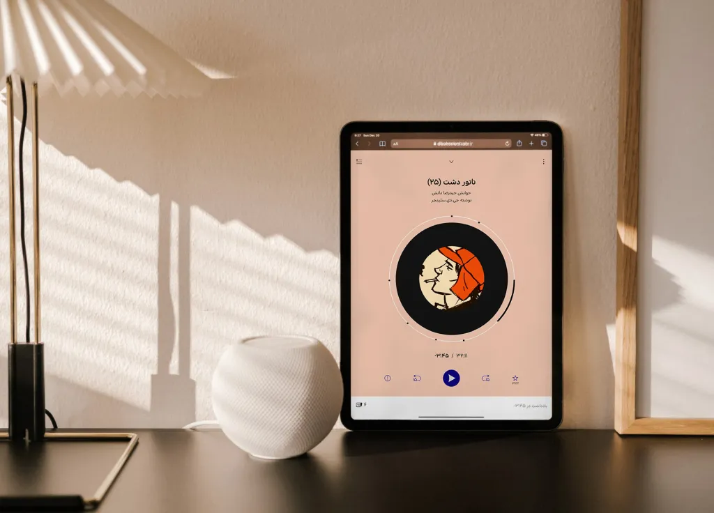
From Episodes to Experiences — Helping “Dasten-e-Shab” Expand Horizons
For a comprehensive look at a project exemplifying a streamlined design thinking process and a substantial focus on visual design, consider exploring this case.
2020
 Read Case Study
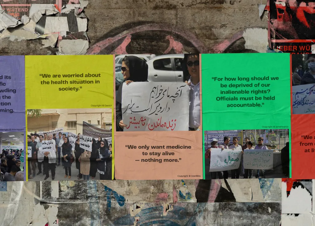
Navigating Medicine Scarcity — A Personal Assistant for Locating Rare Medications in Tehran
If you’re interested in exploring a project that highlights my extensive product development knowledge and adept problem-solving skills, I recommend diving into this case.
2022
Read Case Study

Will Design Save Tehran? — A Speculative Design Exploration for Future Challenges
To witness my experimental, multi-disciplinary, and contemporary approach, I invite you to view this case study.
2020
Read Case Study